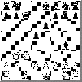
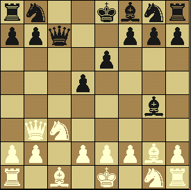
Black and white for me. The new third entry is pretty good, but I'm not a big fan of the brown and tan colors - green and white would have worked better for me. Clearly the improvement was in the display of the white pieces, which is very distracting to me in choice #2. Black and white seems simpler, more straightforward to print and display (and photocopy if necessary).
I vote for the b/w.
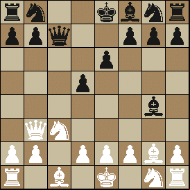
I like your third version.
My vote is for WinBoard.
The left, i.e. the B&W, is by far the cleanest presentation.
The 3rd one!
I vote for the black-white version. I like it more because my eyes are more accustomed to it.
I like the WinBoard image, selection #2 of 3.
I vote for the coloured one.
I prefer the ChessBase Lite one (b/w). I didn't care too much for the colors in the other boards (I might like one of the other two in, say, dark green/light green or blue/grey perhaps).
I would like to see #2 on your site. It is just smooth to look at. I can feel the other boards sting in my eyes :-) .
The black and white.
I believe the white board is easier to see, and most sites also use this pattern and coloring. It is also harder to see the black pieces in the brown version board.
The WinBoard chess diagrams look much better, but then I like WinBoard almost as much as you do!
The ChessBase chessboard is by far better. The WinBoard pieces irritate me greatly due to the color of the white pawns. No matter, what shade of white it is, they clash!!
The black and white. I like the pieces better - the WinBoard pieces blend into the board too much, for me; the ghostly White pieces, especially. The difference would narrow if you used the ChessBase set on your color board...
I prefer the simple black & white Staunton set. Thanks for asking!
3rd one.
The third version is the best. On a larger monitor the dark squares on the B&W make me dizzy. However, the white WinBoard pieces need black outlines.
Both are nice but personally I prefer the B/W version. It's simple and does not add strain to our precious eyes ( I sometimes spend 2 to 3 hrs on the internet ) on an LCD monitor.
I love the third screen shot colors (I currently use the gray-light blue color variation on Mann's page) but still what's missing is the black outline on the White pieces. How hard is it to have a black outline anyhow??
Definitely the image on the left from ChessBase Light. It is not even close.
I like the one on the right. It's different.
I prefer the third board but would make the white pieces just a little less intensely white.
My choice of boards is B&W. Colors can be nice but they can be distracting and a source of endless dispute. As an architect I'm all for new approaches, however I do believe in the saying "If it's not broke don't fix it".
I would like to see the yellowish one more often.
Black & white...sharper and when viewing board positions gets us into the game faster. If you are going to go color you might as well go 3D for total effect of looking at a game board.
I think the board on the left is best!
Though I like Winboard very much, I vote for black & white.
I like the black and white better; it's simpler, and the other ones are too dark. (by the way, the last one would look better if the white pieces had a black outline!)
I like colored screenshots.
Left... straight B&W.
I'm no chess authourity. Just decided to start playing again, haven't touched a pawn in probably twenty years. But I have been a commercial artist. I like your first WinBoard choice. The ChessBase board uses a diagonal hatching that sets up a distracting almost hypnotic effect, plus the contrast is too stark for prolonged viewing. The newer ChessBase uses white instead of cream for the white pieces, probably to increase the contrast. Which it does, but I still like the richness of the cream. Personal preference.
The color boards, of course.
I prefer the WinBoard graphics. As a nurse who has studied anatomy and physiology, I can assure you that if you spend as much time as myself looking at computer graphics, a lower contrast image is much easier in regards to eye strain.
A resounding Hail Mary for the colored versions.
The bw board is much more comfortable to me, but maybe that's just because I'm a Fritz and ChessBase .
I vote for b/w. Color is nice, but white pieces without outline color are hard to see. (and print).
The color one is much better; it's more realistic.
I vote for Chessbase Light, no contest. The resolution is much clearer, and is easier to look at for protracted lengths of time.
I like the one on the right. The White pieces aren't so white. That means the glare on my eyes won't be so bright!
Of the choices shown I votefor the B&W (the first one). I would like #3 the best if the dark squares were green.
My vote: The board on the left.
As they stand, I prefer the b/w version. However, I'd vote for the color (particularly #3) if the white pieces were outlined.
black n white.
I think u should use the 2nd board, although use WinBoard Plus to make the White pieces have a black outline!
The black & white board is the best, in my humble opinion. Very easy for me to see.
right
black & white
Go for the black and white. It's the way the game was suppose to be played. It's legendary and old school.
The third choice is best for me, but might I suggest green and buff squares?
The left, in black and white, is much clearer. Especially the bishops.
I'd go with the left, it's, shall we say, classic. The right is over stated. The White pieces sort of blend in with the board..... Also, WinBoards pieces are too big. (my opinion, a little less per square would be better...)
I prefer the chessboard on the right side of the screen. The colours seem to agree more with the eyes and esthetically more pleasing than the white and black which I feel is too bland.
The first one. Started changing my mind whenI read the comments. Looked at the boards I use at home. Usually green and cream squares (trying to imitate the $8.95 vinal chess boards.) I use the blue WinBoard pieces suggested by another one of your pages. I probably pick the black and white because that's what I usually look at when I print my correspondence positions and carry them around. I eschew the brown boards because I prefer green.